One of the biggest changes Facebook has made in recent memory is the switch to Timeline. With that came the ability to upload a cover photo that displays across the top of your Facebook Page. This large, central picture is sure to make a strong first impression to your Facebook friends. Yet, some churches aren’t utilizing that space the best they can.
Before we look at some examples, it’s important to remember who will be seeing your cover photo the most. Research from Edgerank Checker suggests that only 2% of your currents fans will come back to your Timeline regularly. Most of their interaction with you will happen in their News Feed. So in reality, the people who actually come to your page are people that are new to you on Facebook. This could be a current member looking to connect with you online or a visitor who found out about you through a friend.
With that in mind, here are a few ideas of what images to use accompanied by examples from churches that are using their cover photo well.
Show your church in action. Give people a glimpse of who you are.
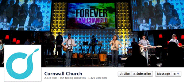
Looking at this image, you know what Sunday morning will be like at Cornwall Church. It's sets an expectation for that the experience will be contemporary and upbeat.
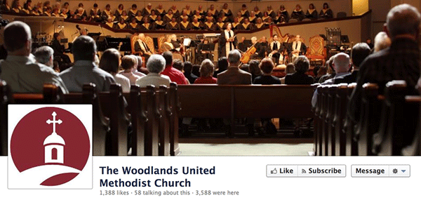
Just like the previous example, you have a good feel for what it will be like to attend a service at The Woodlands UMC.

Using an image like this one sets a tone of missions and service. Based on this, you'd expect Foothills Christian Church to be a place focused on reaching people outside the walls of their building.
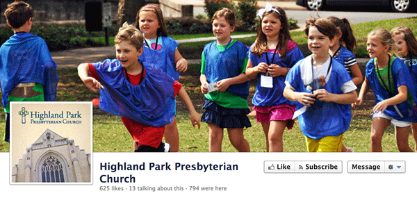
This goes beyond some of the standard pictures you might think of when selecting a cover image. But it does give a glimpse into the churches youth program. Maybe this is VBS? Anyway...it shows that kids are important to this church and there are ways for them to be involved.
Use a picture that says something about what you believe.
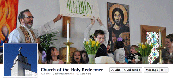
You might be thinking this example should have been filed under the previous section. While this picture does show the church in action, it also says something more. Church of the Holy Redeemer is saying they believe in ministering to children, having them be a part of the service and having fun.
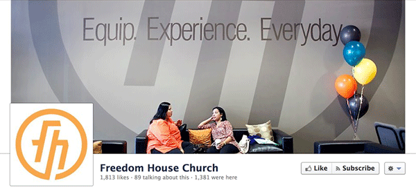
Without getting too fancy with graphic design, Freedom House Church is able to show their vision just by choosing the right place to take a picture. It's already on the wall. The fact that two people are sitting on a couch and talking helps bring home the words. They're experienceing life together.
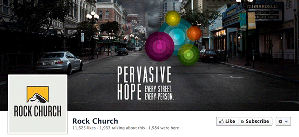
This is a far more literal statement of what Rock Church believes, yet it's still really impactful. The message mixed with an picture of their community makes a bold statement of what they stand for as a church.
Give a sample of who you are.
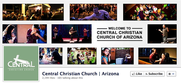
There's quite a bit of real estate to use for a cover photo. Central Christian Church did a good job of showing multiple things: worship, service, youth activities and baptism.
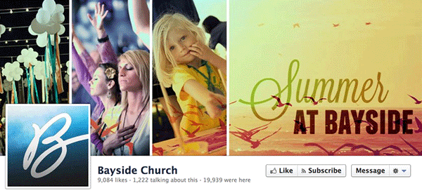
Another good example of using multiple pictures. You get a feel of the atmosphere of Bayside Church.
Highlight a sermon series or upcoming event.
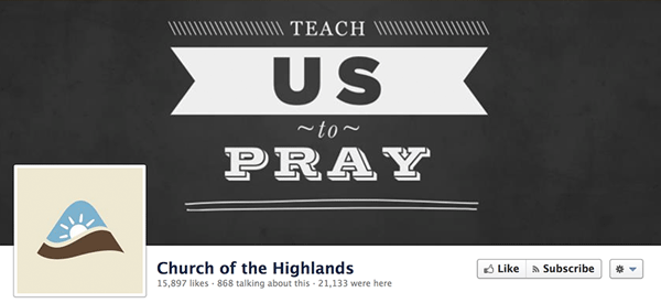
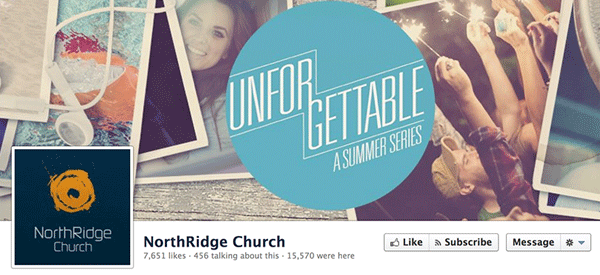
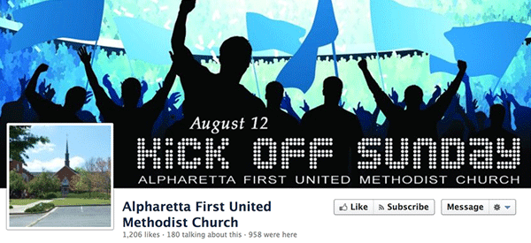
Don’t just use building pictures.
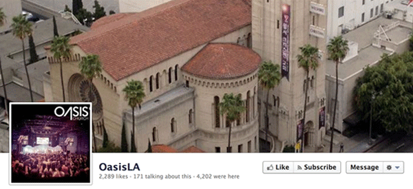
By far, during a random search on Facebook, the most common images were church building exteriors. I get why people use them. They're easy to take. It identifies which church you are in a community. But honestly, it doesn't say much about who you really are. If you must use a picture of your building, Oasis LA did a good job. It's a unique picture of their building, but they tell more of their story by showing a worship service in their profile picture.
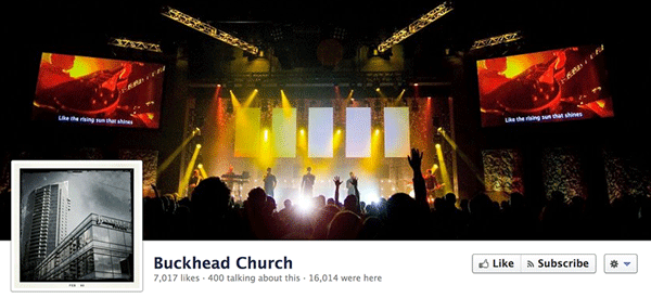
So the Buckhead Church building is not the cover photo in this example. But I think they did a job of using it as the profile picture. When you think about a cover image, also consider how it interacts with your profile picture. Buckhead still uses a picture of their building, but they give more real-estate to showing their weekend experience.
As you're putting together your cover image, it's also important to remember that Facebook has rules about what can't be done. Here are some of the things that churches can't have as part of a cover photo.
- Contact information, such as web address, email, mailing address or other information intended for your Page's About section
- References to user interface elements, such as Like or Share, or any other Facebook site features
- Calls to action, such as "Get it now" or "Tell your friends"
So now that we've gone through some examples, what do you think? What works for you? Are there any other churches, including yours, that are using their cover photo space well?
( P.S. If you're looking for more help with your church's Facebook Page make sure to check out our free ebook Facebook for Churches.)
