Websites are a non-negotiable piece of your church’s communications plan. While some churches have sites that are vibrant and thriving, others still struggle just to get a minimal site online. Regardless of size or skill level, here are a few key areas where you can audit your website and look for areas to make your online presence better.
Content
Is it helpful or is it filler? Many times there’s an urge to fill space or mention every single thing your church is doing. Content needs a reason to exist. If it’s important enough to be on the website, spend the time to make the content compelling and useful.
Are the images moving the story forward? Many church websites lack enough photos of their real members. But just adding pictures willy-nilly is a problem, too. Choose images that are relevant to the content they accompany. Use photos as parts of your storytelling and not just add-ons.
Example: Risen Church - Santa Monica, CA

Example: Cornerstone Community Church - Wildamor, CA

What’s the call to action? Once I’ve seen something on your website, tell me what to do next. Be intentional about creating ways for people to learn more, connect deeper or become more involved.
Example: Destiny Metropolitan Worship Church - Atlanta, GA

Can I easily keep up with updates? Churches often take on too much when designing a new site. Think about what’s realistic to update on a week-to-week basis. The truth is, many parts of a church website can be static content that is updated less frequently. It’s better to have fewer areas that are always up-to-date than a site that’s less reliable in accuracy of information.
Organization
Can I clearly get where I’m trying to go? Good websites make navigation easy and intuitive. Think about the type of people visiting your site and what they’re trying to find. Make it clear where they should click to get their answers.
Is the site cluttered? Resist the urge to pack too much onto one page. It’s good to have open space. Grouping content into chunks of information makes it easier for people to scan and consume.
Example: The Village Church - Flower Mound, TX

Overall look
Does it represent who we are in person? As the front door of your church, your website should give a good view of who your church is and what you believe. Someone who comes to your site shouldn’t be shocked by what they find when they visit in person. Consider color, language, ambiance and images. If you’re an artsy church, it should be clear. If you’re more traditional, that should come through. This is all about being true to who you are.
Example: James River Church - Ozark, MO

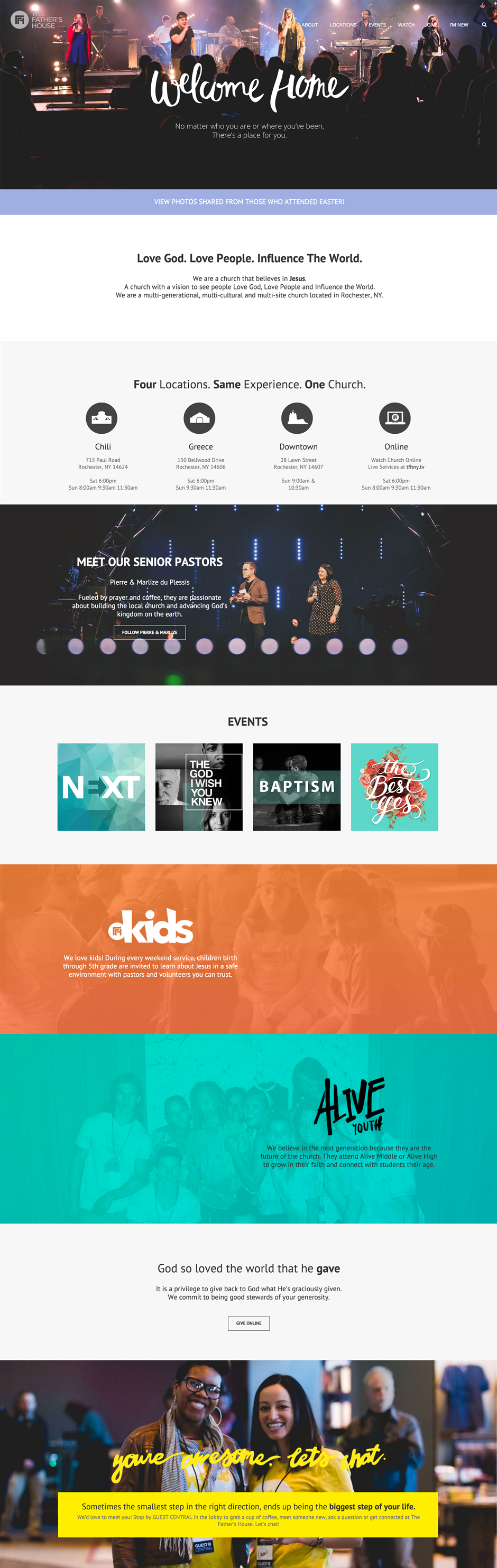
Is it on trend with basic expectations of website design? Long gone are the days of being cool just for having a website. As technology is more prevalent in our lives, so are the expectations of how a website looks and functions. If someone came to your site, is it clear you’re investing in keeping it up to date in design and content? Besides the sites featured in this post, you can also see more great examples at Church Relevance.
Example: The Father's House - Rochester, NY
Is it functional on mobile? More than half of Americans and Canadians have smartphones. Increasingly more people are using their mobile devices as their primary web surfing tools. On top of that, Google is changing search results based on the mobile friendliness of websites. How does your site look and function on these devices? Consider responsive design, which formats your site to work well on any device regardless of screen size. (Read more about responsive design here.)
Example: Park Street Church - Boston, MA
Full Site

Mobile

(The header image of this blog post features the website of Abundant Living Faith Center in El Paso, TX.)

