Designing a logo and ultimately picking which one to use can be quite a subjective process. Everyone has a different design aesthetic. That’s why it’s important not to think about your own personal preferences, but instead think about your brand. If your brand was a person, what would its design style be? What would fit it?
Before we started our logo design process there were a few things we knew about how the Church Juice logo should look, based on the process we went through in defining the name and program concept. We knew the logo needed to be clean and simple with a touch of whimsy. Keeping this in mind, we started to work though a worksheet that our branding company gave us.
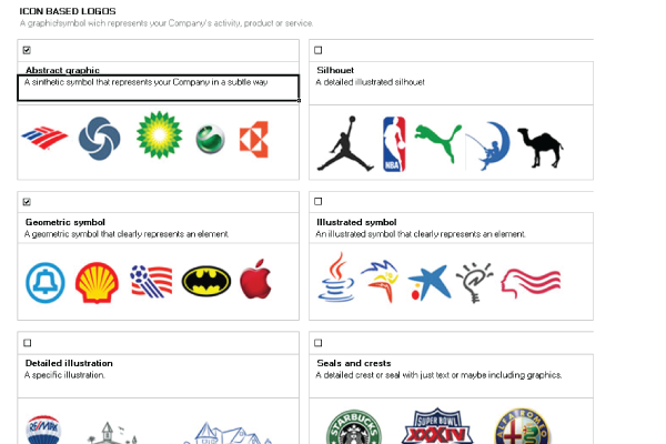
The worksheet guided us through a series of logo and font styles to help narrow down what we wanted. Did we want a logo that was font based, icon based or a mix of both? Should the logo be minimal, artistic, corporate, fun or web 2.0ish? What kind of font would work best--retro, comic, sans serif, handwritten, etc.? What color palate did we like best? Here’s a small example from the worksheet.

As we went through the worksheet, we learned several things. We liked logos that had a separate name and mark. We gravitated toward a graphical element that was either abstract or a geometric symbol. We preferred clean, sans serif fonts. Overall, we kind of wanted that "web 2.0" feel, which can be hard to explain but is used well by companies like Skype or Vimeo.
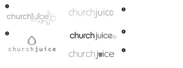
Given these preferences, our branding company gave us this first round of logos. (They’re all black and white since we were just looking at concepts.)

We ruled out some options immediately. Number 2 looked too much like a flame. We didn’t really understand the relevance of the star mark on number 4 (which also looked like the new Wal-Mart logo). And the juice filled “u” on number 5 seemed too literal.
We gravitated to option number 1. We didn’t particularly like the rounded rectangles as the dots on the i’s, but we liked the concept. We liked the idea of the electrical plug of concept 3 as well. At the time, we were still trying to decide what “energy” meant in our tag line, "Energizing church communications." Was it a liquid like juice? Or was it electrical power? To help us process, we asked for those two concepts to be taken a little further. And since we had two options we liked, we decided to ask for one more concept the designers could go crazy with. Here’s what we got back:

From this bunch, we narrowed it down to both bubble options (1A, 1B) and the electrical plug (3B). The one with CJ (6) was interesting, but I was quite insistant that the project not be referred to by initials. Church Juice is only two syllables and 10 letters--it doesn't need any abbreviation. Anyway, we analyzed these as a staff and also did some quick surveying with friends. While the results were somewhat scattered, we liked what people said about the one with the rounded rectangle bubbles (1A). Some people saw bubbles like a caffeinated drink. Others saw TV and computer screens. A couple of people even thought they were electrical outlets. Based on that response, we decided to pick this logo. It was abstract. We weren’t forced to pick what energy literally meant. All of the interpretations made sense, so we decided to let people see what they see.
Up next, it was time to fine tune font, the TV electro bubbles and pick a color scheme.
Other posts in this series:
