Certain events can become a catalyst for change for churches. At Life Baptist Church in Las Vegas, it was a move to a new building. It was a chance for the church of nearly 300 people to start with a clean branding slate to better present their message. It was time to clean up the inconsistent messaging and branding they had in the past.
“I can't overhype the importance of branding. Don't be afraid of it,” says Creative Arts Guy Matt Phillips “The truth is that you are already sending a branded message about your church, whether you are aware of it or not. Therefore, we should be focused and very intentional about the message we are sending so that it can be as clear and consistent as possible.”
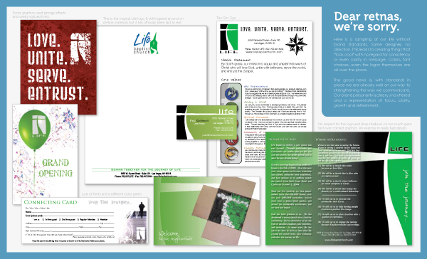
(Click the above image for a PDF of the old, mismatched barding.)
Life started out by asking core questions. Who are we trying to reach? Who are we actually reaching? What are we claiming to offer? Are we offering it effectively? What are we about as church in Las Vegas? What makes Life unique in Las Vegas?
“The goal isn't to grow a church—especially not at the expense of another church nearby. The goal of branding is the advancement of the Kingdom through awesome communication,” says Phillips.
Those vision-clarifying questions, along with guidance from books and help from NewSpring Church in South Carolina, the church worked on a new logo and set of branding standards.
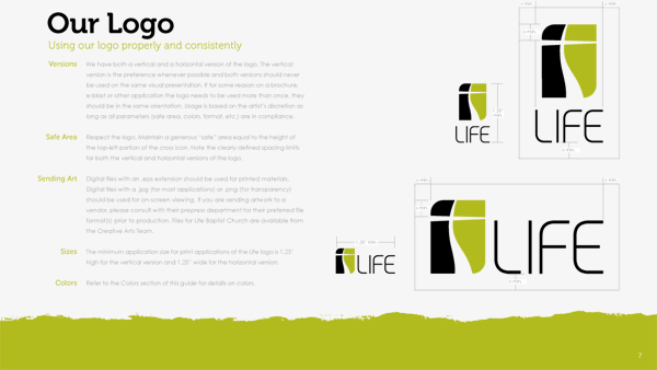
(Click the above image for a PDF of the entire branding guide.)
“Once the standards have been set in place, make sure all of the decision-makers are on board and prepared to ‘police’ the brand. Everything that carries our name is an opportunity to either strengthen or weaken our overall message; a fact that should not be taken lightly,” explains Phillips.
This branding guide was written in a way our judges like. One of them wrote, “I really appreciate the tone of the brand standards guide. The written explanations gently address the concerns about why you have standards.”
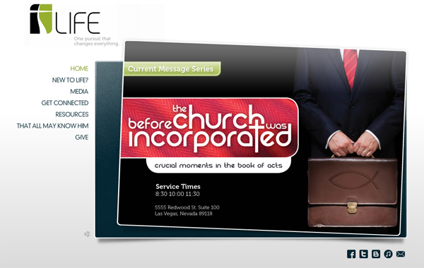
When the new look and standards were in place, Life moved to creating a new website. Like many churches who don’t have a web design person on staff, Life went with Clover. It’s an affordable template site that matched the standards laid out by the church. And even though it’s not custom, Phillips said they were intentional about how they organized information and picked graphics that fit with the look and feel of the church. He says, “I've seen others use Clover and although the functionality of the template is slick, the visual aspects of the site lack professionalism.”

The process Life went through for their rebranding is one many of our judges thought would be a good lesson for other churches looking to do the same thing. One said, “This rebranding could easily be used as a case-study for other churches that are looking to unify their branding, and present a cohesive message.”
Another wrote, “The logos and brand standards themselves are great but even better is the consistent, intentional and user-focused strategy and philosophy underlying them. This is a church that takes its image seriously and put thought into a clear, consistent brand—not just to members but to the community.”
While Life is excited about their new logo and communications standards, they are even more pumped about the opportunity they now have to reach their community.
“The most exciting part about the new facility is that we are not building a church. We are building the first phase of Life Community Center,” explains Phillips. “Our church will use it for offices and weekend services but its primary purpose will be a place to minister to the surrounding community via events, counseling, youth activities, church plants and other groups. Personally, as a minister in the creative arts I can't wait to establish a new place to cultivate the arts in Las Vegas.”


