This article was orginally published on March 15, 2011.
I’ve been watching America’s Next Great Restaurant, a show where contests compete by pitching their ideas for a new restaurant chain. The winner gets funded by Bobby Flay, Steve Ells (the founder of Chipotle) and others who will help the lucky person open a three-restaurant chain with the promise of more.
This past week, part of the competition was creating a logo for their proposed restaurants. While they were overall hit or miss, it was interesting to hear the judges critique a couple of the logos I liked. (And I promise there are some logo lessons coming, so stick with me.)

This first logo is for a restaurant concept called MeltWorks, an upscale grilled cheese restaurant. Basically the idea is to take the cheesy deliciousness of a traditional sandwich and give it some pep and variety by adding various gourmet ingredients. The judges/investors didn’t like the logo because of the cog that replaced the “o” in the word works didn’t convey “grilled cheese” to them. They wanted something food-related instead of a piece of machinery dripping goo.

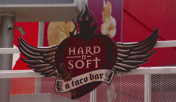
A second logo they really didn’t like came from a taco bar concept called Hard ‘N Soft. The logo had a great grungy feel—almost tattoo-like—that fit the attitude of the proposed business. Again, the judges hated it. The logo was probably their least favorite. The reasoning was similar, too. They didn’t see anything that made them literally think food.
Based on these two examples from America’s Next Great Restaurant I completely disagree with what the judges say make a good logo design. So here are some logo principles I think would serve them better and they apply to any organization whether it’s a business or a church.
Logos don’t have to be literal. A sandwich store doesn’t need to have a piece of bologna in the logo. Church logos don’t necessarily have to include a cross. There’s a whole bunch of great logos out there that are abstract or artistic. What does the Nike swoosh have to do with literally working out? What do the golden arches have to do with hamburgers? Even simple, successful logos like those of Target and Apple have nothing to do with their actual product. They’re literal to the company name, but not what they’re selling.
Literal interpretations are often times the lazy way out. The joke in Christian design is that the best church logo would include a dove, globe, flame and cross all meshed together. Using these literal symbols that are traditionally linked to Christianity is easy instead of taking the time to be creative. If you’re Water’s Edge Church, it may make sense for you to have water in your logo. That’s a part of your name. But if you’re just deciding to use a generic cross design because that’s what churches do, then you’re missing an opportunity. If you are being literal, make sure you’re doing it because it’s the best design, not just the easy way out. (By the way, I’m not anti-cross in logos. I just want to make sure they’re part of a good design, not just a fall-back.)
Logos have a personality. Successful logos are ones that accurately reflect a brand. They show your personality and visualize your style. If someone looks at your logo and then has interaction with you, there’s shouldn’t be a disconnect between the two. It should make sense. The guy with the Hard ‘N Soft taco bar concept has a clear personality that’s reflected by his restaurant. The logo showed that personality. If the logo matches the experience inside the restaurant, the company has successful branding.
Creating a logo is a subjective process, so have a brand ambassador. Whenever a logo’s being made, there are going to be a lot of opinions. Everyone has their own design esthetic. So make sure you have someone who really understands the brand you’re creating a logo for. Do they get the personality? Do they know what the experience is like interacting with your organization? That person should be a gatekeeper in saying what’s true to the brand and what isn’t.
