(The Juicys are a way to recognize and reward those churches who’ve worked to improve their church communications during the last year. It includes giving them a grant to jump start their next project. This week we'll be announcing the 2012 winners.)
Newsletters can be a major frustration for churches. Oftentimes members want them, but church staffs don’t always have time to create the content for them. Plus they can become dumping grounds of information. Westbury United Methodist Church, a 350-person congregation in Houston, Texas, found themselves in that situation and believed there had to be something better.
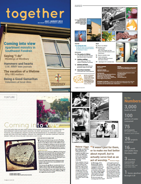
Knowing that their congregation still needed to rely on paper more than technology, Westbuy decided to ditch the monthly black and white newsletter and launched a full-color magazine published 6 times a year. Gone was the long letter from the pastor and articles written by staff. The top down broadcast of information was out the door, too. Now the magazine was collaborative relying more on the congregation finding and telling each others stories.
“Our title, ‘Together,’ reinforces the value of Christian community as we serve and worship God alongside one another,” says Director of Communications Kelsey Johnson. “We envisioned a new format that would invite more contributors from the congregation and the community to write articles, submit photographs, provide quotes and offer insights.”
Besides being collaborative, the new magazine does a lot of other things, too. It’s erases some of the duplication of information that happened with trying to fill a monthly newsletter. There’s more color on the page. And now there are more stories of the life change happening in the church.
“The vibrant photographs, first-hand stories, pull quotes, sidebars, graphics and stats synchronized to really enliven the publication and make it more interesting to read and appealing to share with friends and neighbors,” says Johnson.
That dramatic format change won over our judges.
One judge wrote, “The focus has shifted from static information to dynamic storytelling. Now that’s inspirational.”
Another judge said, “If you’re going to do print, do it the best they can. Color draws attention. Layout matters. Stories are always better than a list of facts. This church knew it’s congregation and how it consumed information. They met that need with a quality product.”

(Click here to download a PDF of the whole magazine.)
Johnson knew there would be people skeptical of the change. Afterall, some people dislike change just because it’s change. She explained, “Recognizing that reality, we prepped the congregation for the change by offering a digital preview of the magazine the week before it was published. We notified the lay leadership teams well in advance. We also made sure we introduced the changes and gave a brief rationale in the editor's letter at the front of the magazine. Because we had been inviting contributors along the way, there was already a buzz within the church as we all anticipated the first issue.”
Overall, the response was mainly positive. The main complaint was people wanting it every month. To fill that need, Westbury pushed people to their weekly email that had a more detailed list of what’s going on in the church.
So what’s next for Westbury? They plan on using their $2000 grant to put up TV’s around the building that can show slides of important announcements.
Johnson adds, “The screens would also help to welcome and orient visitors to our church campus throughout the week and on high-traffic Sunday mornings.”
Want to know more about this project? Check out Westbury’s application video.
