Creating website wireframes is the step we skip far too often when designing a new website. It’s easy to get excited about a flashy new look, but it can be hard to have tweetable moments when thinking about a bunch of empty black and white boxes on a sheet of paper.
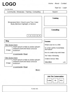
 But wireframing may be the most important step any organization can take when putting together a new website. It helps you take your sitemap, a list of features and categories, and give it some shape. To the left is a picture of a wireframe we’re looking at for the new Church Juice website so you can see what one looks like. We have one of these for nearly every page that will be on the site.
The first thing I like about the wireframe process is it makes you think like a website user. It forces you to answer the questions: What do I want people to do when they come to this website? Who is coming to this site? What are they looking for?
Once you have those questions answered, wireframing lets you create the paths that will get users to that information. If you’re a church, for example you want to make sure there are clear ways for potential guests to learn about your church. The visitor wants to learn more about the church. What is a typical service like? What time does it start? Can I wear jeans? Where do I drop off my children? Can I watch a video sample of worship service so I know what I’m in for?
As your wireframing you might decide that you want a box or button that says “New to First CRC?” And once someone clicks they’re directed to a page with the stuff listed above.
Likewise you’re going to want to look at other navigational paths for other groups of people coming to your site. What’s the path for a member? How about someone looking to check out the audio of last week’s sermon?
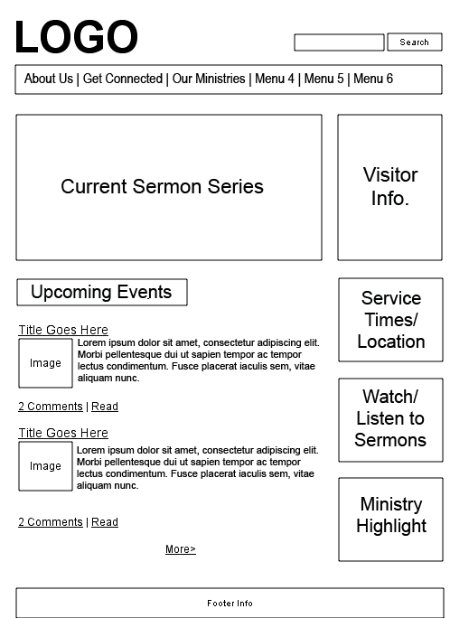
Here’s a sample of what it might look like.

