When I first visit a website, it’s pretty easy to get a sense of whether or not it’s appealing. Are you the same way? On first glance, there are a lot of elements that go into making that first impression. When I stop to truly analyze what those things are, here some pieces that come to mind.
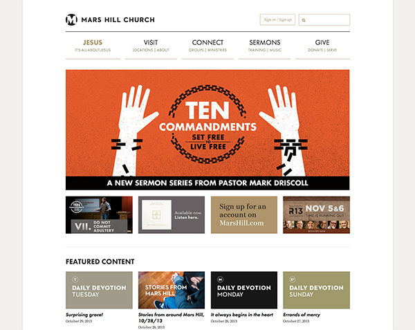
Clean homepage. This is your first impression for people coming to your church online. Are you a clean, organized kind of place? Or is everything out of place and cluttered? It’s important to remember that not everything you want to say has to be on the homepage. Organize information into chunks. Keep text to a minimum. Give breathing room and don’t be afraid of white space.
Example: Mars Hill (www.marshill.com)
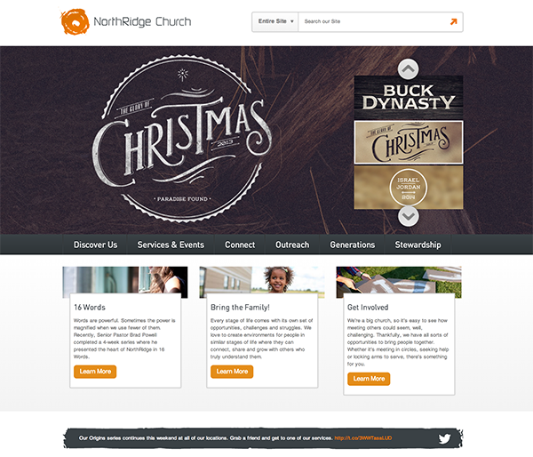
Example: NorthRidge Church (www.northridgechurch.com)
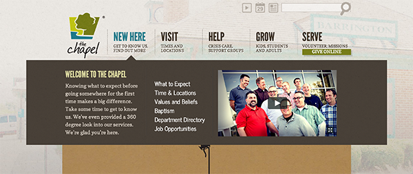
Easy to navigate. If your homepage design is clean and well organized, it will be clear where someone should click to find more information. Think of the different people coming to your site and what their needs are while they’re there. How will a visitor know where to click for more information? Will a member know where to click to find upcoming events? Your actual navigation menu can help, too. Make sure those items are limited, easy to understand and well organized.
Example: The Chapel (www.chapel.org)
Useful information. For some churches, the website is the hub where every piece of information goes. That can create a lot of clutter and disorganization. Again, remember your end-user. What information do they need? Also think about your web strategy. What are your goals for sharing information on the website? Like any communications tool, a good website takes strategic thought.
Simple information. Another key for making information useful is to make it simple. Just because someone sends you five paragraphs of information doesn’t mean all of it has to go on the website. Part of your job as a communicator is to edit and clarify. How can you make it shorter and simpler so someone actually consumes it?
Example: Mission Community Church - What to Expect Page (www.mission68.org/visit/what-to-expect)
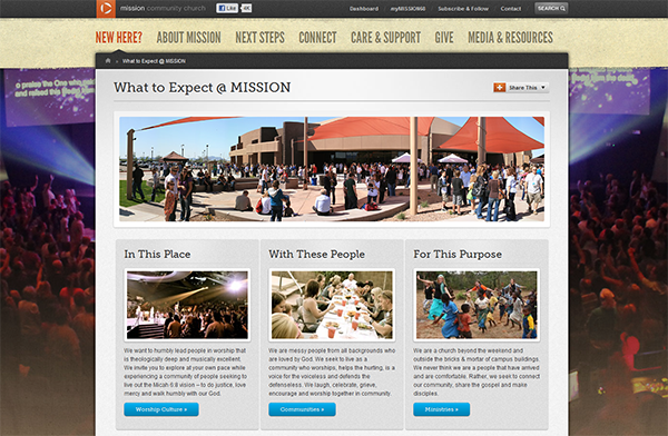
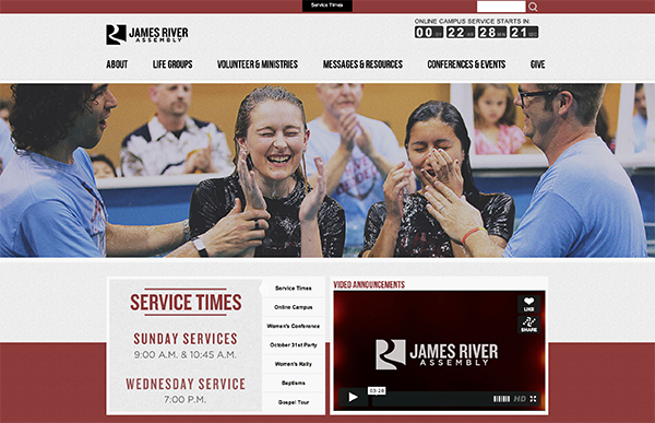
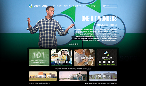
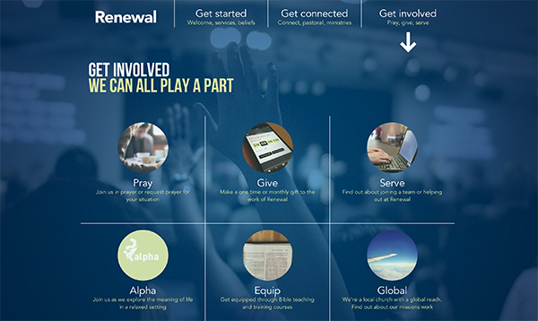
Visually interesting design. I realize defining interesting design is up for interpretation, but I think most web users can tell when a site is graphically up to date. Being up to date means following some trends. Images play a big role in web design. Many churches use pictures that fill the whole width of the screen. That’s a prime way to say something visually about your church without having to use a single word. And when you do use words, less is more. Small chunks of easily digestible information, supported by a graphic or image, are far more effective then large amounts of text.
Example: James River Assembly (www.jamesriver.org)
Example: Southland (www.southlandchristian.org)
Example: Renewal - Get Involved Page (www.renewalcc.com/get-involved)
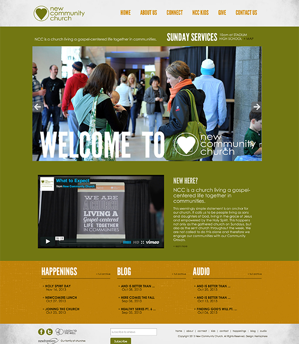
A true reflection of who you are in person. Part of creating a consistent experience is making sure your website is a good representation of who you are in person. If someone came to your website and then visited you in person, would they feel any sort of disconnect? Be true to who you are. Leverage your strengths. Give people an online glimpse of your church in action.
Example: New Community Church (www.ncctacoma.org)
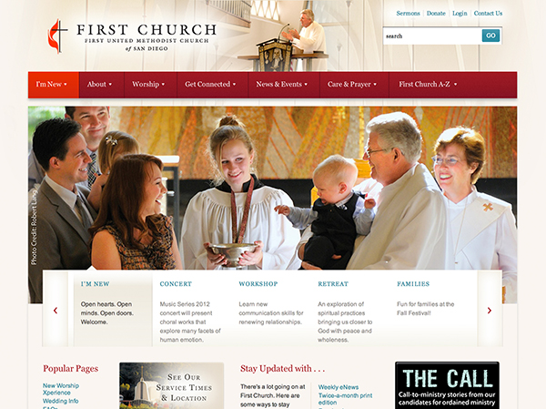
Example: First United Methodist San Diego (www.fumcsd.org)
What would you add to the list?
